vi tag 2103: meet 2013
virtual identity employee event branding
Once again, I was asked by Virtual Identity to brand their annual employee retreat. This year, it was hosted in the enchanting Austrian ski resort of Alpbach. As I sat down in October to brainstorm, I considered the elements at hand: Austrian colors, natural alpine material palette, Virtual Identity square/pixel visual language, Tirolean locale, winter season, retreat motto of "Meet" (employees to analyze, identify and optimize meeting culture). My sketching resulted in creating a snowflake as possible reference to all.
 |
The pompom hat goes viral. |
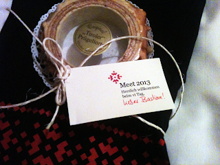
The identity was branded across welcome and info packages using natural materials for guests upon arrival. Within minutes, Alpbach was a blizzard of red pompom hats. Event t-shirts, schedules and "Tiroler Prügeltorter" lovingly welcomed each guest to their cozy room.
 |
Naturally packaged & heart-felt Welcoming. |
Signage and infographics were prepared as wayfinding and orientation. The soon-to-be-specified new house font for vi, Georgia, was used within the program as a softlaunch for exciting things to come for vi in 2013. Stay tuned on that one...
 |
The perfect magnet. All details considered. |
One of the most interesting aspects of this year's program was the design of three awards, to be presented to the winning teams of the creative presentations as the culmination of the event. Working with the logo, I envisioned it as a real snowflake, three-dimensional, as ice, captured in a frozen moment.
 | ||||
The finished awards await their recipients… |
Here I thank both glasteam and Schreinerei Küper in Munich for their collaborative input and ideas which helped bring my cardboard and xerox mock-ups to chrystalline life.
 |
My first mock-up, testing glass thickness and using scotch tape to simulate sandblasting. I just love playing around in my studio like this. |
 | |
Testing the award pedestal groove, type of wood finish and rubber stamping at the carpenter. |
 |
Final assembly at the glassworks. Kid gloves required. |
We ran environmental graphics on the fabulous stage, running abstract, morphing animations of alternative snowflake formations, underscoring the dynamic, unique and intricate structure of meetings, strengthening the retreat motto. These reels ran through breaks and various presentations.
The event t-shirts were created in white, red and black. Employees were quick to model this new take on vi-meets-Nordic-knit. A shout out to georgefrank for their ever-awesome printing and managing of our endless drafts of size and color variations. Flockdruck never looked so fine!
 |
Identity reinterpreted in Nordic Knit. |
Pfirtie Alpbach! (Go ahead. Google that one…)


I think it was exceptionally well done Heather, thank you!
ReplyDeleteThank You! Great Job! Udo
ReplyDelete